The power of the word EastEnders carries a lot of weight within British television, it has remained one of the UKs most popular television shows in British history. Throughout its historic 35-year run the audience have been enticed by their dramatic and powerful storylines including scandals, murders, romance, betrayal and the surprise arrivals and departures of iconic characters. It has become a staple throughout so many homes. But, have you ever wondered about what went into creating such a well-known title screen? And why it is so recognisable?

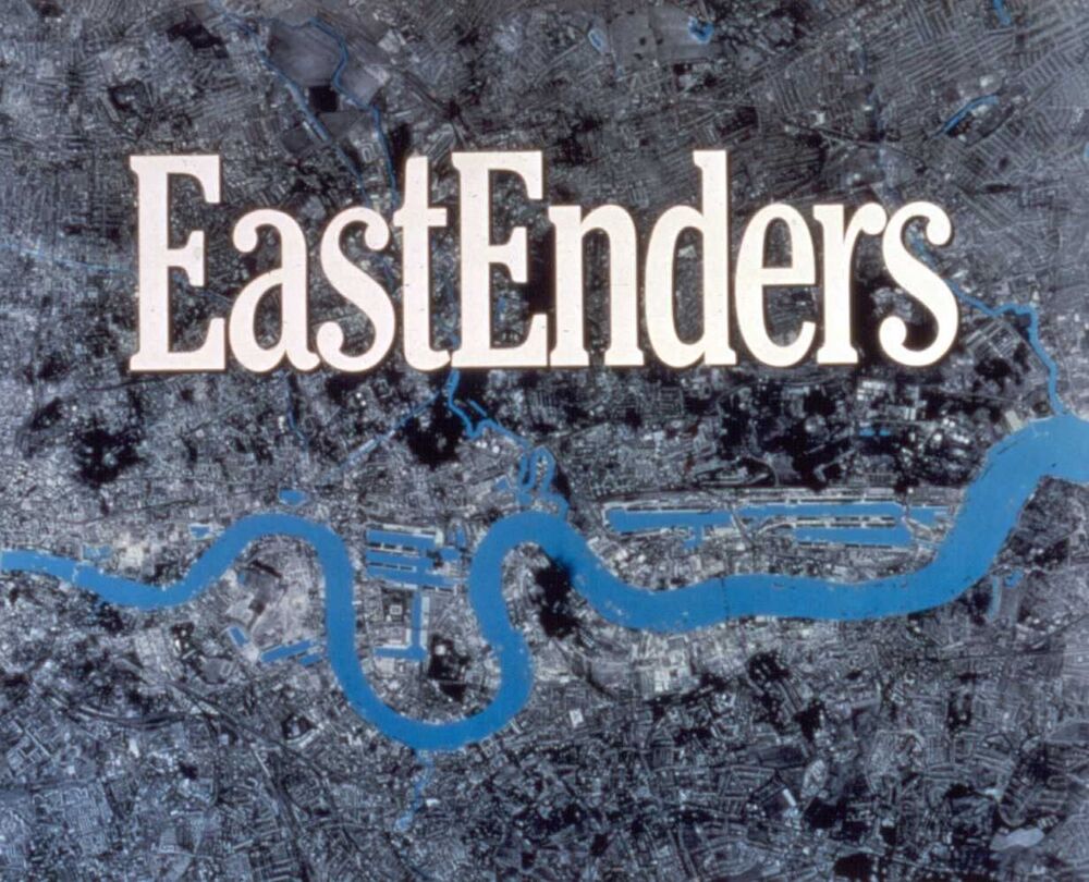
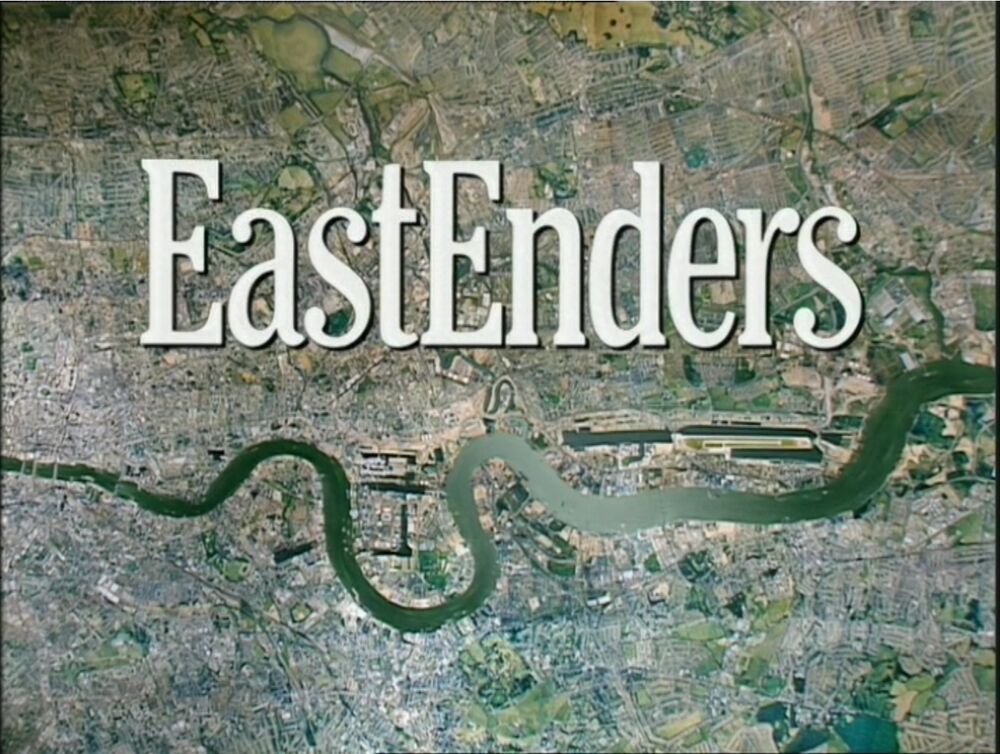
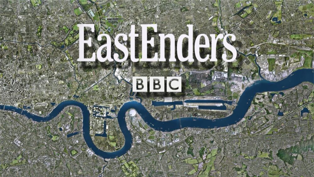
Throughout the shows run starting in 1985 to present the background of title screen has been changed many times due to the ever-changing and evolving landscape of London, however the typography of the wording of EastEnders has remained the same. This has created iconic symbol that has allowed viewers to feel comfort in the recognition and familiarity of the words that greet them and fill their screen. It indicated to many viewers that it is time to relax and unwind for the day giving them a positive association with the EastEnders brand.
The EastEnders brand is associated with the three main aspects of the show the theme tune, the title screen and the ending drum beats tune, but the title screen and more importantly the typography that has become famous in its own way. It was designed by BBC designer Alan Jeapes who created the EastEnders identity with a custom font just for the show in 1985, as well the show uses the typeface called Cheltenham which was originally created in 1896. This font is unique and well recognised through the enormity of the show, as it subtly tells you what to expect from the show and some of the key themes incorporated within.

We can see this as it seems to be a form of classic serif font maybe suggesting EastEnders is a classic soap opera but with its own unique twists. As well we can also see that it shows a high X height allowing the words to become more legible and easier to read form a further distance and at a smaller font size, this seen throughout the showbiz community to better promote and add awareness to productions as many know if you can’t read the name of the show, no one will watch it. This is also demonstrated with the colour of the lettering in the word ‘EastEnders’ as the white is a contrast against the city background and is used to grab the viewers’ attention as a highlighting tool. The colour white is also associated with positivity, light, humility and beginnings, this entices the audience as they now associate EastEnders with these positive connotations and are intrigued to watch it and discover more.
The font also tells us a lot more as the weight of the typeface is regular throughout demonstrating that the show is consistent and reliable as it has shown to be, being consistently on the air for 35 years becoming a comfort to many. Along with the weight the title also shows a regular width and contrast allowing the audience to see the text clearly and have great a clear image in their mind to associate with the brand.

Overall, I believe the EastEnders brand demonstrates a very classic image indicating to the viewers their style and reputation which has been built through the years on screen with strong consistency and comfort, Unchanging in title and relevance.
